

Zara navigation redesign
Explore a UI/UX redesign project focused on enhancing the Zara website's navigation. Discover the challenges addressed and the innovative solutions implemented to improve user experience.
The challenge: Inefficient navigation
User wants to find an outfit in a particular color, size and price range. They may experience difficulty in efficiently finding products per their preference due to overwhelming choices & limited filter options. This can lead to frustration, longer browsing times & abandoned purchases.
Existing Site Navigation

Research & Analysis-
I analyzed the existing Website to find the pain points and how the navigation can be made better. Competitive Analysis of similar websites help find solutions for better navigation.
User Pain Points
❌ Hidden navigation
❌ Too many clicks
❌ Hard to browse categories
❌ Product discovery is slow
❌ New users feel lost
User Persona

Redesign
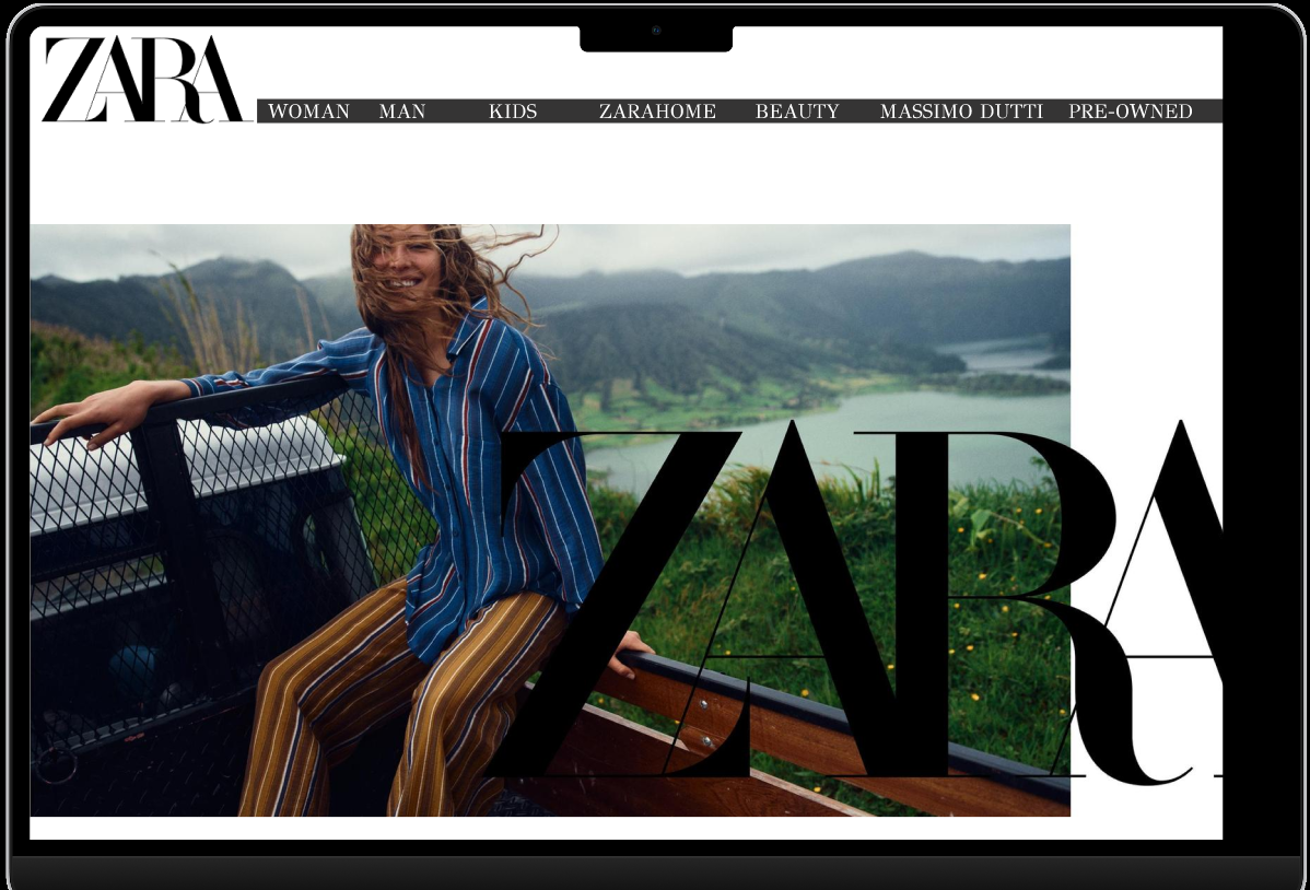
The redesigned Zara homepage addresses one of the most common usability challenges on the original website—difficulty discovering products quickly. While Zara's visual-first approach reinforces its luxury fashion image, users often need multiple clicks to locate specific product categories. The redesign introduces a clearer navigation structure that improves product discoverability without compromising the brand's clean aesthetic.

Key Design decisions-
Enhanced Top Navigation
- A persistent horizontal navigation bar was introduced with clearly labeled categories such as Women, Men, Kids, Zara Home, Beauty, Massimo Dutti, and Pre-Owned.
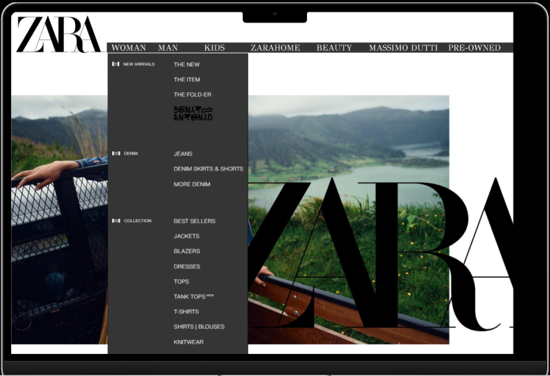
- Each category includes drop-down menus that allow users to navigate directly to product types.
Improved Product Discoverability
- Quick-access drop-down menus help users locate specific products directly from the homepage.
- The redesign minimizes unnecessary exploration and improves efficiency.
Maintaining Zara's Brand Identity
- The minimalist color palette, generous white space, bold typography, and large lifestyle imagery have been retained to preserve Zara's premium fashion aesthetic.
- The navigation enhancements blend seamlessly into the existing visual language.
Better User Experience
- The simplified information architecture decreases cognitive load by organizing products into logical categories.
- Users can complete shopping tasks more efficiently, resulting in a smoother browsing experience and a shorter path to checkout.
Create Your Own Website With Webador